Thursday, December 24, 2015

Beach House Master Bedroom/Bath and Guest Room Before and Afters

Happy holidays! 

If you missed my previous beach house posts you can go here, here, and here.

To jog your memory this house was decorated on a VERY TIGHT budget so my goal with the bedrooms was to include one item with impact in each space that would make it special and specific to each family member.

First up is the master bedroom. My clients wanted something un-cluttered, simple, modern and fresh.

Here is the Master Bedroom before


Here is the after


Throw by lemlem

The art was the main element in this space. I loved my clients piece that we hung next to the modern canopy bed. We kept everything else simple and clean.

Here's the master bath before 


After


We glazed over the red marble-meat colored tile by glazing it all white and replaced the cabinetry, painted the walls a light gray and accented with navy. Done. Simple and clean.

Guest Bedroom Before


The After

Bold banana leaf fabric by Bassett McNabb
Robert Abbey table lamp
pillows and headboard designed custom by SKDesigns

As you could probably guess the main design element in this space was this fabulous headboard and pillows designed in this bold, large scale pattern.


To recap


Rooms that are simple, clean yet fun and kind to the wallet:)

One last thought...

Thanks so much for reading my blog this year! and

Saturday, December 5, 2015

Before and After Beach House Part 3

Back to the beach... I know, I know Christmas is around the corner and winter is settling in but I'm still thinking beach:). 

So i thought I'd continue the tour of the Avalon house. 
If you missed the previous beach house posts you can go here and here.

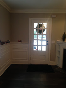
Let's head upstairs to the family room/dining room. This is how the owners found the space.

Family Room/Dining Room Before


Below are the sofas we re-purposed here for this space.


Family Room/Dining Room Now

table lamps Regina Andrews
pillows Quadrille in kazak

swivel chairs by Lee Industries


Large abstract by Baltimore artist Janine McGuire


 Pillows Quadrille in kazak


light fixture Anthropologie
table custom


So how did we approach this space? First we repainted all of the dark paneling decorators white and added new cypress hardwood floors. We also removed the stone fireplace. This was not in the original plan due to budget constraints but we discovered it was unstable and unable to hold the TV so we removed the stone and added new dry wall. For a little pop we painted the interior of the fireplace box a bright blue. 

We kept my client's coffee table and just styled it. We also added new slip-covered sofas and linen swivel chairs from Lee industries. 

To add just the right amount of color and pattern, we added custom made Quadrille pillows with a bright blue contrast welt. The pillows you see on the swivel chairs I bought retail and added the perfect color trim to the plain white pillows. And we hung a large colorful abstract in between the sliders. 

The cool light fixture above the table is from Anthropologie and the dining table was custom made by the owner.

One last look.

Before

After


Thanks for reading!! xoxo

Sunday, November 29, 2015

Teenage Bedroom Refresh Before and After

So one more mini-makeover before I share the rest of the beach house before and afters. If you missed the previous beach house posts you can go here and here.

But first, here's a quick teen bedroom makeover for a client's daughter. It was her Halloween/Birthday surprise. 

I have worked fast before but this one REALLY takes the cake. 

We only had two weeks to complete this. Yikes! I had to buy everything on the spot practically right there on sight after I took measurements. We could only purchase items that would arrive in one week. Challenging yet so fun!

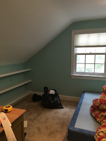
Here is the before
(It was used as a storage space)


My client's daughter wanted a more sophisticated color palate and uncluttered space so we painted the walls classic gray and all the trim super white by benjamin moore.  The room was given a clean, fresh start. She also loves black and white and loves sailing in the summer. So we incorporated that into her room as well. 


Here is the after

(not the best pictures it was POURING down rain that day)

Table lamps and nightstands from Pottery Barn Teen
Chair custom Stephanie Kraus Designs


leopard pillow Etsy, lambswool pillow West Elm


I just love pairing leopard with black and white!

Bedding Bloomingdales


The shoes were a gift from here mom.... LUCKY gal!


Bath Before


Just some navy paint after


Simple, clean uncluttered and perfect for a teen!

Want to see more teenage bedroom before and afters go here and here.

That's all for now....

Thanks for reading!!

Monday, November 23, 2015

Older House Renovation Before and After

I thought we'd take a break from the beach house update and give you a sneak peek into another renovation I worked on this past year. This was an old house built in the early 1900's that was rehabbed beautifully by a local builder. The house was taken down to the studs and completely gutted.

You can read more about this home here and here.

The client and I worked together on the finishes, lighting, flooring,  paint colors and interior furnishings. The entire house is not "decorated" yet. They have two small children so they're taking their time and decorating in stages.

But I thought it would be fun to share where we are so far.

Living Room/Entry

I don't have any real "before" pictures but I do have where we started the design process... an empty room which is both a living room/entry for the home. This client loves lots of pattern and color. So this project was right up my alley!

Living Room/Entry Before
(these are bad pictures of a pretty space- cloudy day)


As you can see this room will be an entry point and needs to have appropriate flow from the entry door to the stairs and to the rest of the home. It also needed to be bright, open and spacious.

We chose to use four swivel chairs instead of a sofa and two chairs so the room would not appear blocked off or have any weird dead spaces in the back. 

For additional seating we added two cubes under the console in the back of the room. 

With this configuration the room looks beautiful no matter how you enter.

Living Room/Entry After

Window Treatment fabric by Kravet in riad indigo
Lee Industries swivel chairs custom upholstered in Quadrille fabric
Little table by oomph
Paint color nimbus benjamin moore


Lamps Robert Abbey
Console Society Social
Bright orange cubes s private label Stephanie Kraus Designs, LLC.


Here's a peek into the kitchen 


Beautiful white cabinetry and gray subway tile.

And a quick look at the master bath


Modern, fresh and serene.

Hope you enjoyed this mini tour.
Thanks for reading xoxo!!