Sunday, November 29, 2015

Teenage Bedroom Refresh Before and After

So one more mini-makeover before I share the rest of the beach house before and afters. If you missed the previous beach house posts you can go here and here.

But first, here's a quick teen bedroom makeover for a client's daughter. It was her Halloween/Birthday surprise. 

I have worked fast before but this one REALLY takes the cake. 

We only had two weeks to complete this. Yikes! I had to buy everything on the spot practically right there on sight after I took measurements. We could only purchase items that would arrive in one week. Challenging yet so fun!

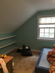
Here is the before
(It was used as a storage space)


My client's daughter wanted a more sophisticated color palate and uncluttered space so we painted the walls classic gray and all the trim super white by benjamin moore.  The room was given a clean, fresh start. She also loves black and white and loves sailing in the summer. So we incorporated that into her room as well. 


Here is the after

(not the best pictures it was POURING down rain that day)

Table lamps and nightstands from Pottery Barn Teen
Chair custom Stephanie Kraus Designs


leopard pillow Etsy, lambswool pillow West Elm


I just love pairing leopard with black and white!

Bedding Bloomingdales


The shoes were a gift from here mom.... LUCKY gal!


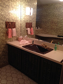
Bath Before


Just some navy paint after


Simple, clean uncluttered and perfect for a teen!

Want to see more teenage bedroom before and afters go here and here.

That's all for now....

Thanks for reading!!

Monday, November 23, 2015

Older House Renovation Before and After

I thought we'd take a break from the beach house update and give you a sneak peek into another renovation I worked on this past year. This was an old house built in the early 1900's that was rehabbed beautifully by a local builder. The house was taken down to the studs and completely gutted.

You can read more about this home here and here.

The client and I worked together on the finishes, lighting, flooring,  paint colors and interior furnishings. The entire house is not "decorated" yet. They have two small children so they're taking their time and decorating in stages.

But I thought it would be fun to share where we are so far.

Living Room/Entry

I don't have any real "before" pictures but I do have where we started the design process... an empty room which is both a living room/entry for the home. This client loves lots of pattern and color. So this project was right up my alley!

Living Room/Entry Before
(these are bad pictures of a pretty space- cloudy day)


As you can see this room will be an entry point and needs to have appropriate flow from the entry door to the stairs and to the rest of the home. It also needed to be bright, open and spacious.

We chose to use four swivel chairs instead of a sofa and two chairs so the room would not appear blocked off or have any weird dead spaces in the back. 

For additional seating we added two cubes under the console in the back of the room. 

With this configuration the room looks beautiful no matter how you enter.

Living Room/Entry After

Window Treatment fabric by Kravet in riad indigo
Lee Industries swivel chairs custom upholstered in Quadrille fabric
Little table by oomph
Paint color nimbus benjamin moore


Lamps Robert Abbey
Console Society Social
Bright orange cubes s private label Stephanie Kraus Designs, LLC.


Here's a peek into the kitchen 


Beautiful white cabinetry and gray subway tile.

And a quick look at the master bath


Modern, fresh and serene.

Hope you enjoyed this mini tour.
Thanks for reading xoxo!!

Sunday, November 15, 2015

Before and After Beach House Part 2

Here's Part 2 of the beach house tour. If you missed Part 1 you can go here

Now here's where we get really creative and I mean REALLY REALLY creative. 

As I mentioned in my previous post, the owners were on a very tight budget because they weren't sure if they would be here for just a season or maybe two. So naturally no major work was performed just a cosmetic update.

I'll share the before and after pictures first, then I'll explain the creativity behind the scenes. It was both a challenge and fun working within the these budget parameters.

 So stick around you'll want to hear what we did:)

This is the before picture of the lower level family room

BEFORE


Family Room After


Before I go into detail about this space you'll  want to see the before of the lower level guest bath


Guest Bath After


Let's talk about the family room first.


The dark paneling was kept and painted white. How did we stay on budget with this project? None of this furniture is new. Nothing. This furniture was the previous owners and it was cleaned, painted and recovered. It totally has that beachy, palm beach feel doesn't it?

Why keep the furniture? 

1) The owner really thought this was going to be a temporary fix  and this room is so awkward if we purchased new upholstery for this room we couldn't be sure if it would fit or would work in a new space. 2) We had a vision that if we re-purposed the furniture it would give it a cool vibe and make the space interesting, unique and so fun! 3) Budget. That's the real reason:)

So the table. A table, magazine rack and lamp all in one.
Gotta love the practicality and the throw back, right?


We painted it bold blue by benjamin moore so it would pop off the white walls. I purchased a new shade and trimmed it in blue.

The rattan sofas
The frames were painted bold blue too and reconfigured to help with the flow of the room. Here is what they looked like before.


 The sofa cushions were re-covered in an indoor/outdoor fabric from Trina Turk for Schumacher. Since it wasn't a complete re-upholstery job it was inexpensive to re-purpose these pieces. And I designed the throw pillows to break up the mod pattern on the sofas.

The table. It weighs a ton and it has that beachy, palm-beach vibe. Why mess with it?

Here is the family room again.


Moving onto the Guest Bath


All we did was re-glaze all of that beige tile. If you need an inexpensive way to update a bathroom with crazy colored tile re-glazing is the way to go. A new basic shower enclosure was also added. 

One last look.


Paint color palladian blue by Benjamin Moore
Little table - oomph


More to come so stay tuned. Thanks for reading! xoxo

Tuesday, November 10, 2015

Beach House Before and After Part 1

I know it's fall and winter is upon us but I thought I would share a project I worked on this summer. It was a beach house built in the early 70's and I don't think much changed in this house until my clients and current owners purchased the home last year. 

So, a little background on this house-- the owners hired me for a temporary fix. Yep. Temporary.

Just to get it up and running and functional for a season or two because they weren't sure if they were going to sell it or tear it down and build new.  So as you can imagine it was a VERY tight budget knowing it may not be there next year.

And NO new kitchen, NO new bathrooms, NO new window treatments or major renovations of any kind were done and happy to say it turned out so pretty they may keep it longer than expected.

AND I think it's a great example of how you don't have to tear these old houses down just spruce them up a bit and they can be so charming! One more interesting fact is the owner grew up coming here as a boy. He knew the family and knew that the house was filled with love and special memories and he wanted to re-create that same feeling for his family.

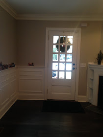
Without further ado, I'll share the before pictures of the entry as my clients found it

Entry Before


Entry Now


The wall-to-wall carpet was removed. New cypress flooring was bleached to keep it from yellowing and then installed. The dark wood paneling was kept just painted decorators white  and all of the trim was painted super white by Benjamin Moore. The red console is from Host Interiors Ardmore, PA and is by Mitchell Gold  and Bob Williams. I love this console for tight spaces and trust me it's a great red.


 The owners weren't sure what to do with the iron railing but I wanted to keep it as is. I love the lines of this railing. They just don't make'em like this anymore.  Look how fresh and clean the space looks now.

At the end of the entry we had this BEFORE


AFTER


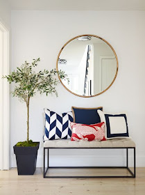
This was sort of an awkward space because to the left of this bench is the entrance to a bedroom. But we added a bench and a few custom pillows. 

In every project I  try to use fabrics and pieces that I've never seen/used before and that have personal meaning to my clients.  I usually get tired of seeing the same fabrics and furniture pieces used over again and I don't want my clients house to feel like a furniture showroom, RH or PB or whatever their favorite furniture/accessory store may be. It has less meaning and it would feel like they've seen this before... right? 

In addition, I always try to include something custom and original in every room to make it special and specific to each homeowner. So as an ode to the owner who is an avid fisherman and boater we added the red Manuel Canovas calypso pillow in red and the navy and white "flagish" looking pillow on the bench. Just enough (I hope) without being too "theme-y"

I also added a large mirror to open the hallway and reflect light from the new door the client added. You can also see the modern flush mount lighting we added in the reflection of this mirror. The new design of this space turned this dark entry into a light-filled fabulous space. 

The goal was to turn this 70's house into a clean, modern fresh space with clean lines yet keeping it a bit traditional in line with the client's taste. 

Stay tuned each week as I share the before and after's of this fun, yet budget-minded beach abode!

oh and if you want more mind-blowing before and afters on the web check out Calling it Home's One Room Challenge here. This is where talented designers transform one room in six weeks. Enjoy!

Thanks for reading!! xoxo