Here's Part 2 of the beach house tour. If you missed Part 1 you can go here.
Now here's where we get really creative and I mean REALLY REALLY creative.
As I mentioned in my previous post, the owners were on a very tight budget because they weren't sure if they would be here for just a season or maybe two. So naturally no major work was performed just a cosmetic update.
I'll share the before and after pictures first, then I'll explain the creativity behind the scenes. It was both a challenge and fun working within the these budget parameters.
So stick around you'll want to hear what we did:)
This is the before picture of the lower level family room
BEFORE
BEFORE
Family Room After
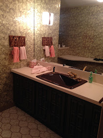
Before I go into detail about this space you'll want to see the before of the lower level guest bath
Guest Bath After
Let's talk about the family room first.
The dark paneling was kept and painted white. How did we stay on budget with this project? None of this furniture is new. Nothing. This furniture was the previous owners and it was cleaned, painted and recovered. It totally has that beachy, palm beach feel doesn't it?
Why keep the furniture?
1) The owner really thought this was going to be a temporary fix and this room is so awkward if we purchased new upholstery for this room we couldn't be sure if it would fit or would work in a new space. 2) We had a vision that if we re-purposed the furniture it would give it a cool vibe and make the space interesting, unique and so fun! 3) Budget. That's the real reason:)
So the table. A table, magazine rack and lamp all in one.
Gotta love the practicality and the throw back, right?
We painted it bold blue by benjamin moore so it would pop off the white walls. I purchased a new shade and trimmed it in blue.
The rattan sofas
The frames were painted bold blue too and reconfigured to help with the flow of the room. Here is what they looked like before.
The sofa cushions were re-covered in an indoor/outdoor fabric from Trina Turk for Schumacher. Since it wasn't a complete re-upholstery job it was inexpensive to re-purpose these pieces. And I designed the throw pillows to break up the mod pattern on the sofas.
The table. It weighs a ton and it has that beachy, palm-beach vibe. Why mess with it?
Here is the family room again.
Moving onto the Guest Bath
All we did was re-glaze all of that beige tile. If you need an inexpensive way to update a bathroom with crazy colored tile re-glazing is the way to go. A new basic shower enclosure was also added.
One last look.
 |
| Paint color palladian blue by Benjamin Moore Little table - oomph |
More to come so stay tuned. Thanks for reading! xoxo


Stephanie! I love this transformation! That fabric on the rattan sofas is genius!
ReplyDeleteThis comment has been removed by the author.
ReplyDeleteYou have got to be kidding - this looks like a completely new home!! Expertly done. The blue painted furniture and new T.T. fabric is perfect beachiness
ReplyDeleteDarlene
I can't believe it is the same space???? and furniture/!!!! Fabulous!!!
ReplyDelete